Hierarchy
Content and actions competed for attention instead of guiding the user.
BEVOL is a volunteering platform connecting people, organizations, missions, rewards and community activity. The redesign focused on making that ecosystem easier to understand and more consistent across the product.
The previous experience lacked a clear visual hierarchy and consistent component behavior. Mobile and web also felt disconnected, while interactive states and multi-image content were not always obvious to users.
Content and actions competed for attention instead of guiding the user.
Component styles and interaction patterns changed across the experience.
The mobile experience did not feel fully aligned with the web product.
Missing states and animations made some actions difficult to read.
Twelve in-depth user interviews were conducted over roughly one month. The research exposed four recurring pain points: app smoothness, the gap between app and web, weak visual feedback, and a broken multi-image experience.
The redesign introduced a clearer type scale and layout grid, a unified component system, research-backed UX decisions and a more purposeful visual language that could scale across the product.
Two notable additions were a direct chat experience between volunteers and organizations, and smart in-feed cards that bring missions, rewards and events into the feed without breaking its rhythm.
Messaging, voice notes, imagery, online presence and read states in one flow.
Relevant missions, rewards and events appear as native product content.
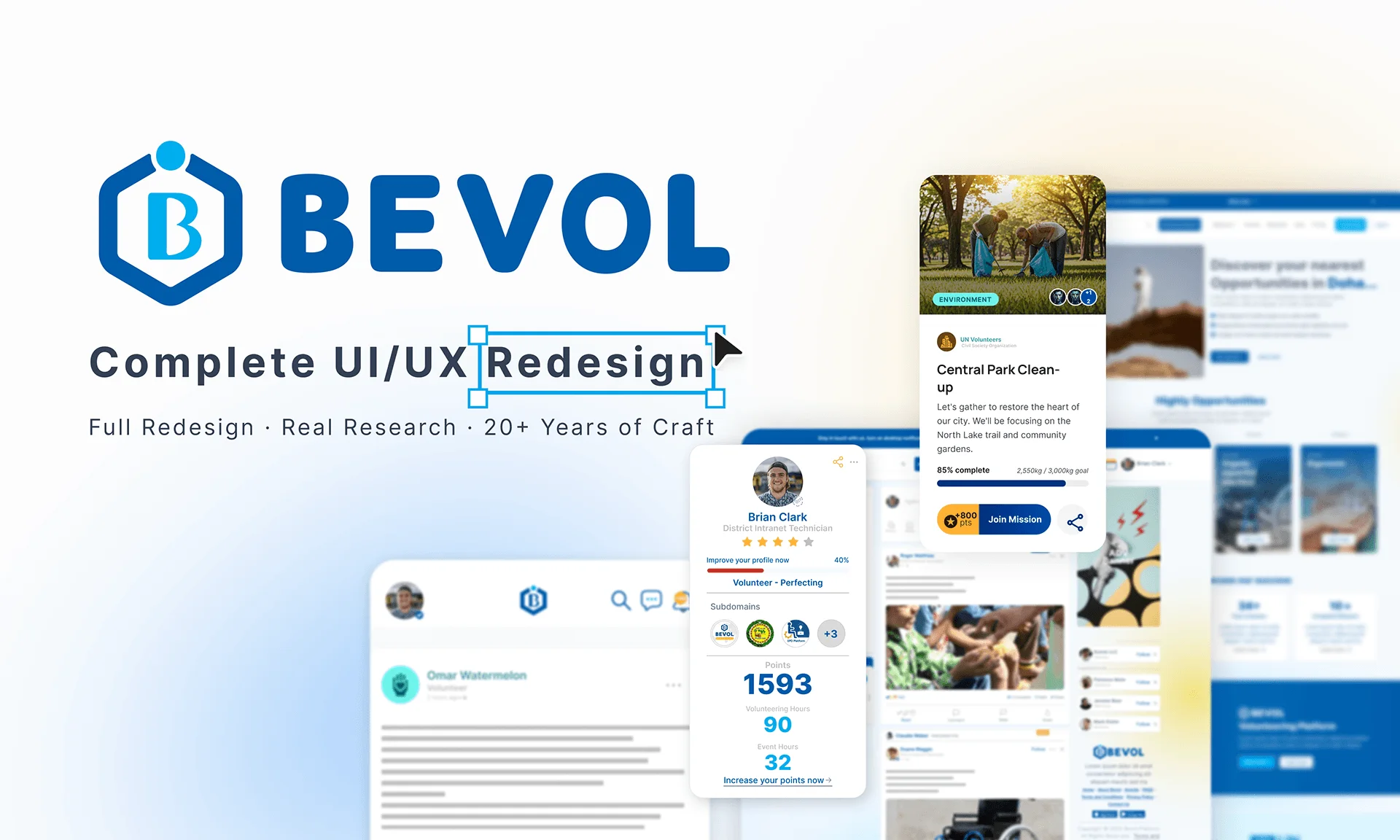
Rather than isolating the redesign as a set of abstract rules, the project overview brings the real BEVOL redesign artwork into the case study without presenting repeated crops as separate screens.
The redesign brought the core experience under one clearer visual and interaction system: stronger hierarchy, more consistent components, better alignment between mobile and web, and new features shaped by user research. No post-launch business metric is claimed here; the documented outcome is the product system and experience delivered through the redesign.
Content, navigation and actions follow a more deliberate visual order.
A shared system reduces visual drift across screens and features.
The product language is more consistent across major touchpoints.
Chat and in-feed cards were introduced around identified user and platform needs.